Proximity
G2
Principles of Design: Proximity

This site demonstrates good proximity between images and text. I also like the way that it spearates different sections. Each section is clearly designed and helps the user understand what images and pictures belong to each heading. It doesn't feel overly clustered or confusing either.
Alignment
G2
Principles of Design: Alignment
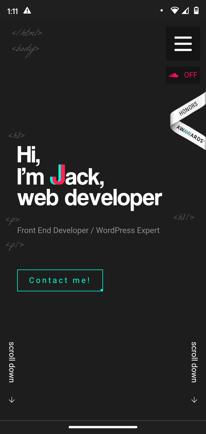
I chose this site because of the alignment he chose here. He aligned his title for the page one the left along with the html tag doodles in the background. Then he placed his navigation button on the right side of the page along with an option to turn sound on. Pretty creative and visually appealing. This site is actually pretty cool, the mobile experience is great but I like the desktop experience even more.
Repetition
G2
Principles of Design: Repetition
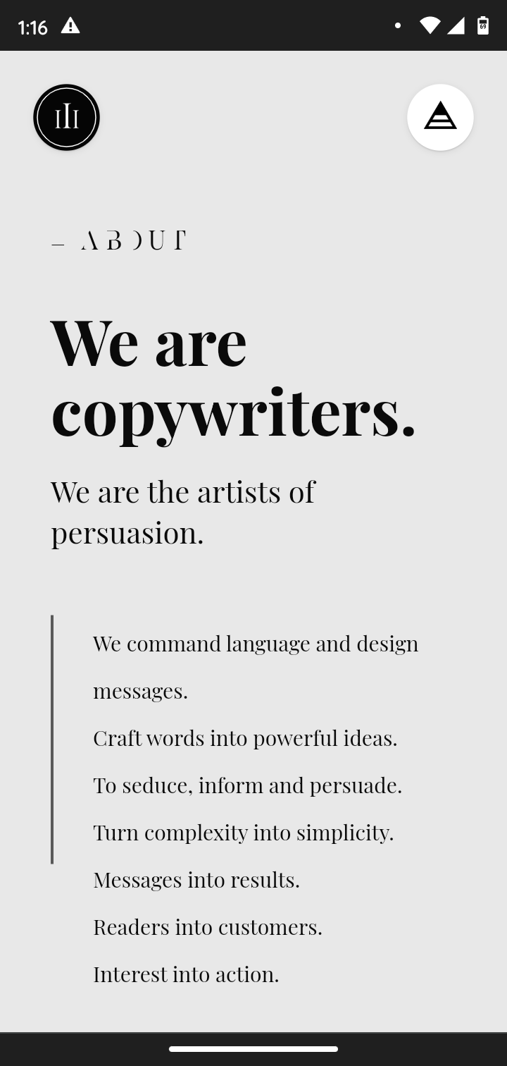
How does this site demonstrate good repetition? The image you see here is the first of several sections that are layed out just like this. Each section changes the background color from the previous. Here the developer succesfully relays the information they want you to know but does it in a visually catching way. Each section is different but similar to the last keeping your attention but also creating a connection with the other information in the list. Super cool!